Price It Right: How Win-Loss Analytics Helped Improve Pricing Strategy
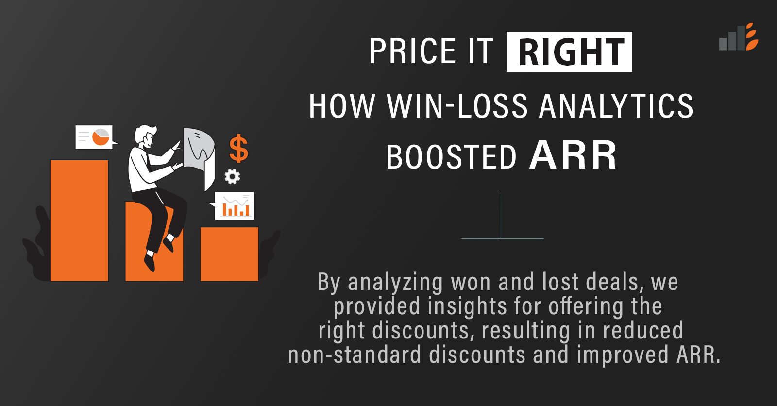
By analyzing won and lost deals, we provided insights for offering the right discounts, resulting in reduced non-standard discounts and improved ARR.


By analyzing won and lost deals, we provided insights for offering the right discounts, resulting in reduced non-standard discounts and improved ARR.

Whether you’re a business user newly learning SQL or a Data Analyst who is already a pro, it never hurts to keep a handy reference guide for a quick peek the next time you’re writing an SQL query!

Built a support dashboard to visualize customer support metrics for the client’s end customers, enabling them to understand better the value of excellent support offered.